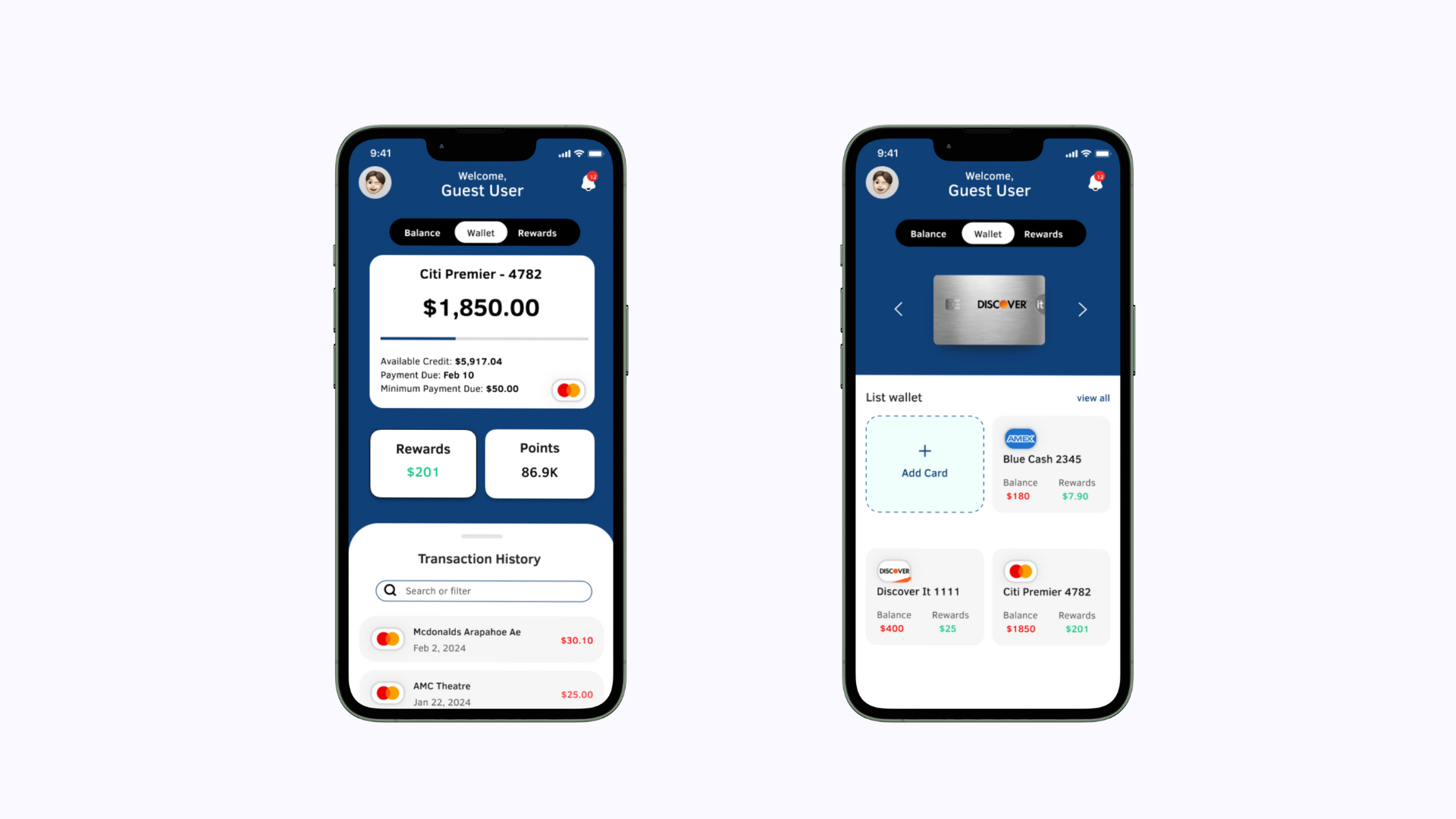
ROLE
UX/UI Designer, User Research
TOOLS
Figma, Figjam, Canva
DURATION
8 weeks
Overview
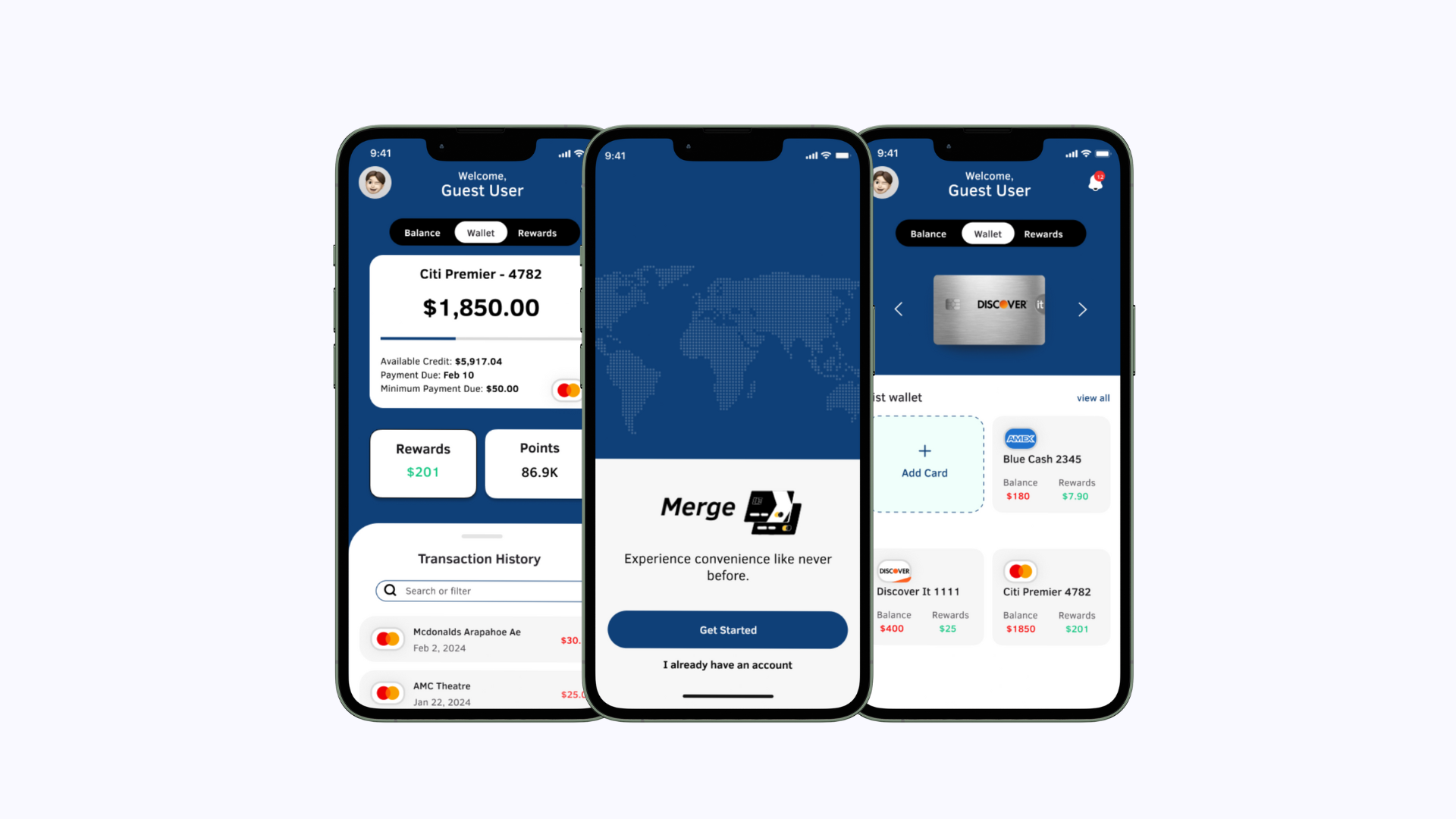
Merge simplifies credit card management by consolidating all your cards in one place. Easily track transactions, view balances, and explore rewards, all within a single app.
Problem
Juggling multiple credit cards can be tough, often leading to missed payments and missing out on rewards. As users accumulate more cards, it becomes a hassle to check balances or due dates across different apps.
Objective
Design an end-to-end application that makes handling credit cards easy. A simple interface that aims to be user-friendly, requiring minimal effort. This way, users can quickly check their balances without any hassle.
Goals
Identify common pain points in the current process for credit card management
Understand what would make the process feel easy and trustworthy on mobile devices, especially since financial management can be stressful and result in negative interactions.
Discover best practices for designing credit card management processes by looking at similar applications.
RESEARCH
User Survey
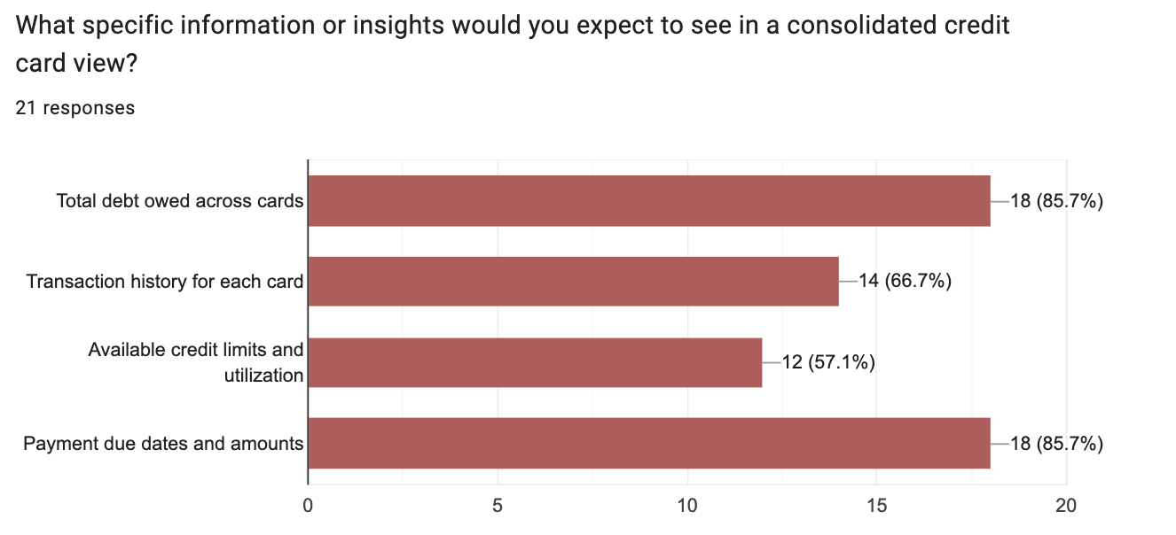
Participants: 21 | Format: Google Forms
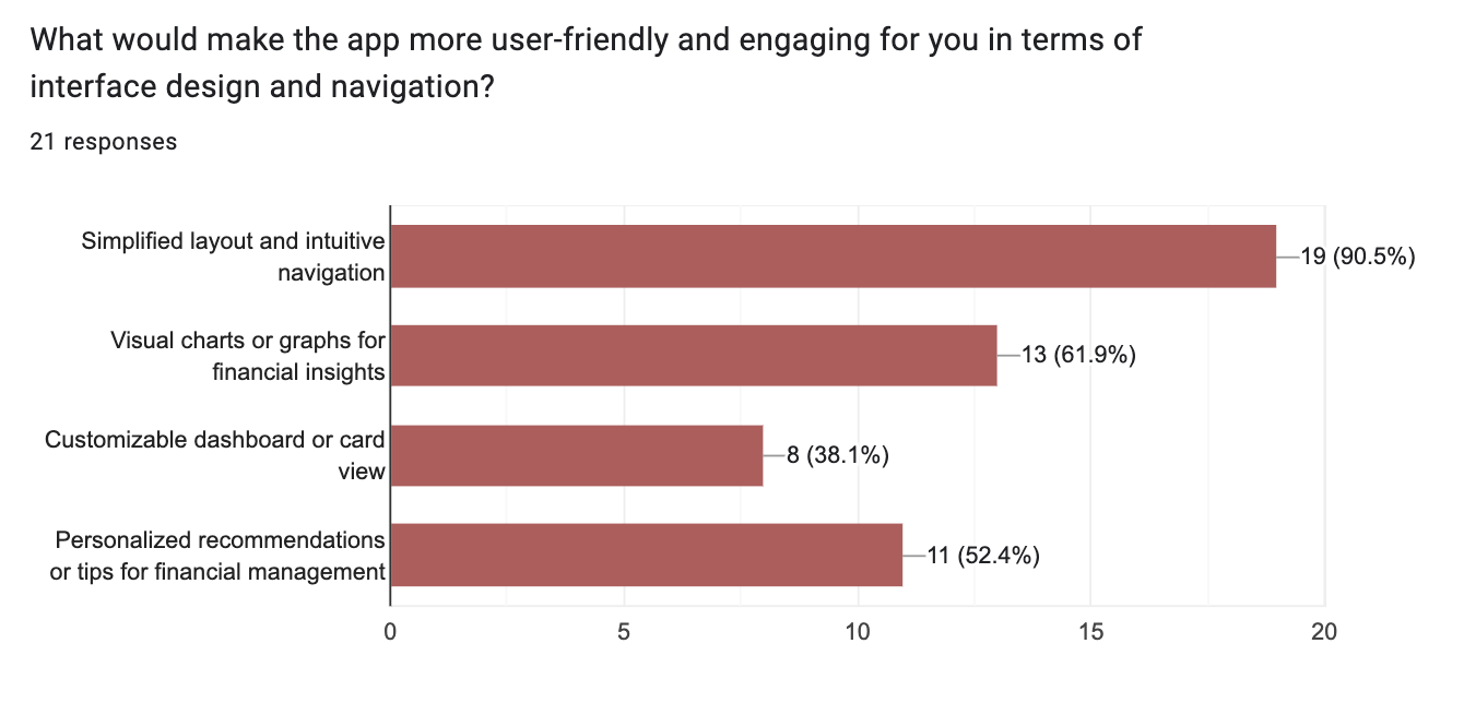
The survey and interviews were conducted with individuals who currently hold two or more credit cards. The survey enabled me to gather valuable insights into users' current management practices, desired features, essential features, and the overall experience they seek in a consolidator app. This information serves as a guiding point for the design and overall user experience of the app.
Interview Insights:
Users sought a single view for all card balances and transactions.
Visual simplicity and less clutter in the interface, along with ease of navigation, were priorities.
Users prioritize rewards maximization, highlighting the need for the app to offer a consolidated view of balances and payment reminders.
Competitive Analysis
It was time to explore the existing apps and address some key questions:
How can I stand out in this oversaturated market?
What are they offering that others are not?
What’s working and what’s not?
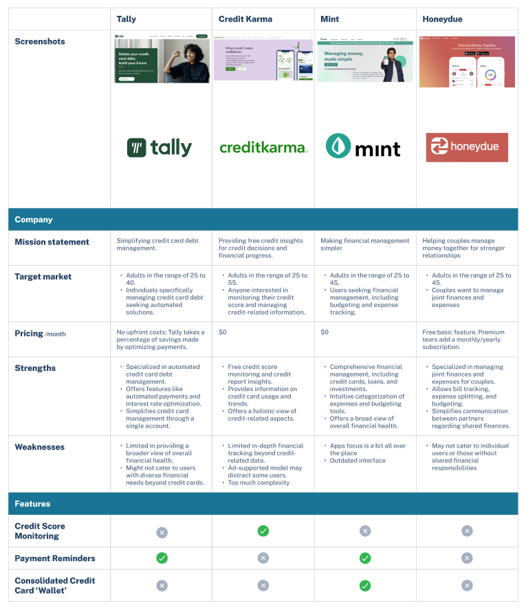
Through my findings, I was able to narrow down to analyzing Tally, Credit Karma, Mint, and Honeydue
Immediately, I found a breakthrough. There are no apps that simply JUST let you check your balance. While these apps offer great features and capabilities, I aimed to create an app similar to a widget for quick balance checks. If users truly required additional functionality, they could utilize their credit card's dedicated app.
Okay...keeping it simple…should be easy…
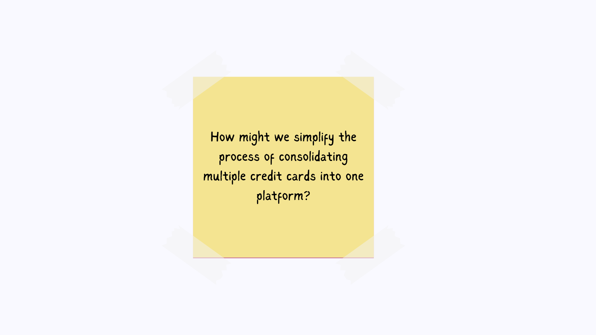
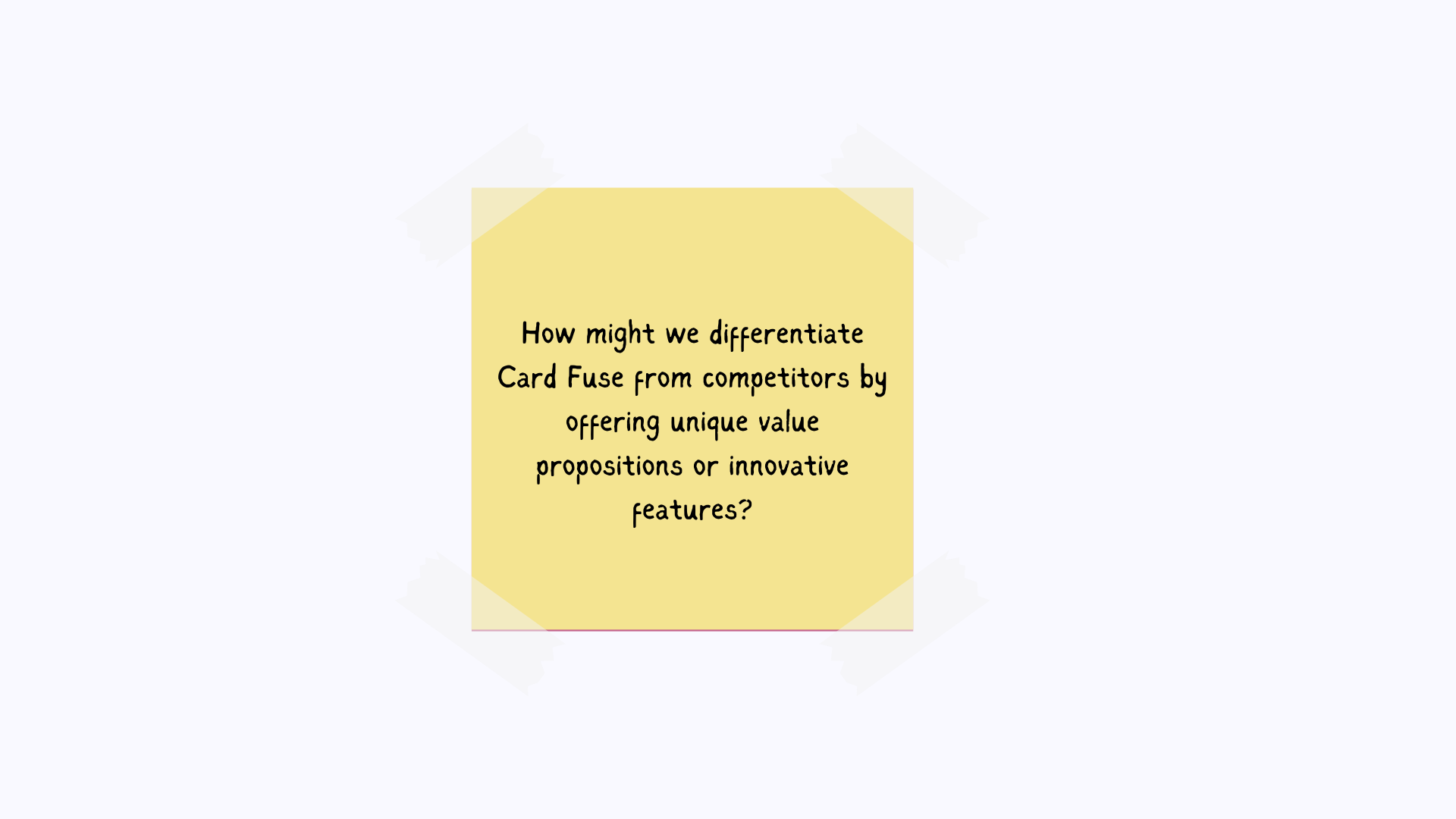
Well, the only way to find out is to keep brainstorming. I took my research findings and decided to reframe my problem statements into "How might we" questions. It's my favorite thing to do as it's the bridge between thoughts and iteration.
By asking those 'How might we' questions, I felt like I was unlocking doors to a whole new realm of possibilities. It's like turning on a light bulb in a dim room—everything suddenly becomes clearer, more exciting.
Asking these questions made me go back to my user interviews, giving me a real sense of what people truly want compared to what businesses think. It was like peering into the heart of the matter. Combining this with my competitive analysis, I could see the gaps where other businesses had missed the mark.
User Persona
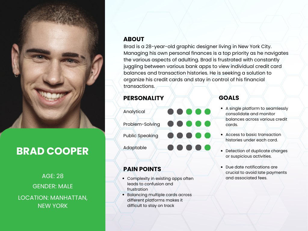
Pooling together all my research, I noticed recurring patterns from both my research findings and interviews. These patterns guided me in crafting the user persona depicted below.
**User Persona Graphic
IDEATE
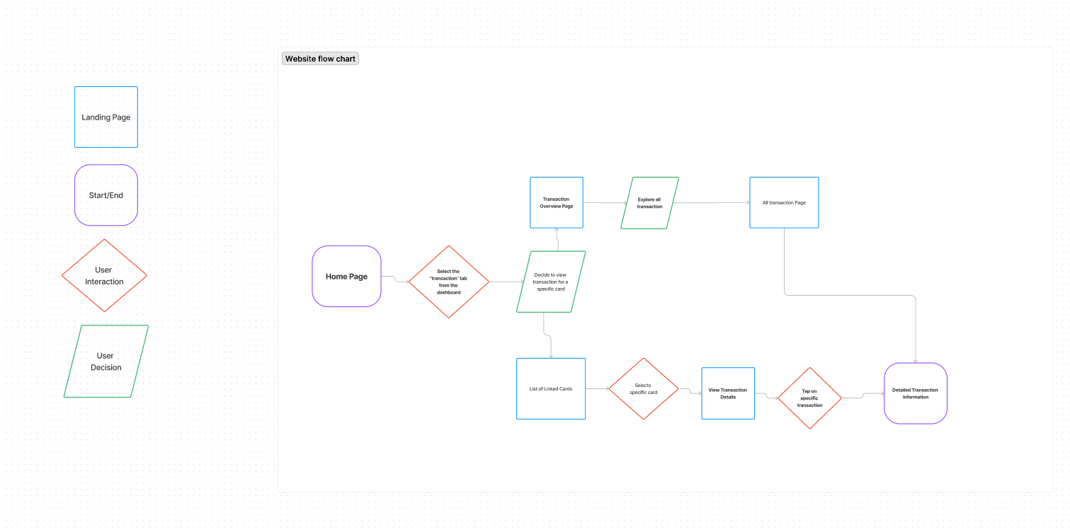
User Flow
Below, I have mapped out the user flow for those who wish to view their detailed transaction information, emphasizing simplicity and ease of use.
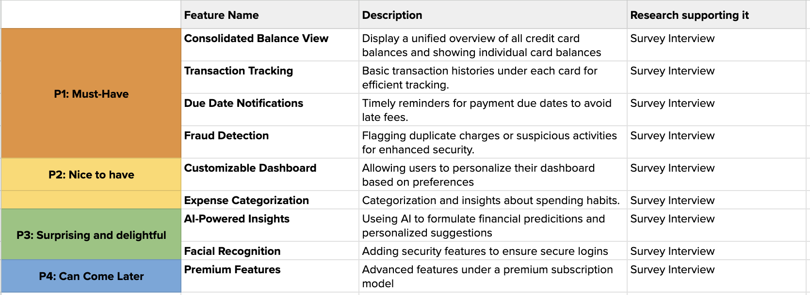
Feature Set
The features are categorized into what is necessary and what could be potentially added based on my user surveys and research. This serves as my checklist for prioritizing what I need to focus on and what can be added in the future.
I also realized the importance of ensuring users feel secure when using a third-party application. This realization prompted me to prioritize the onboarding process.
Given that this is arguably the most crucial aspect of the app, being the first point of interaction upon download, I wanted to make sure users are guided into a positive experience, right to the dashboard.
DESIGN
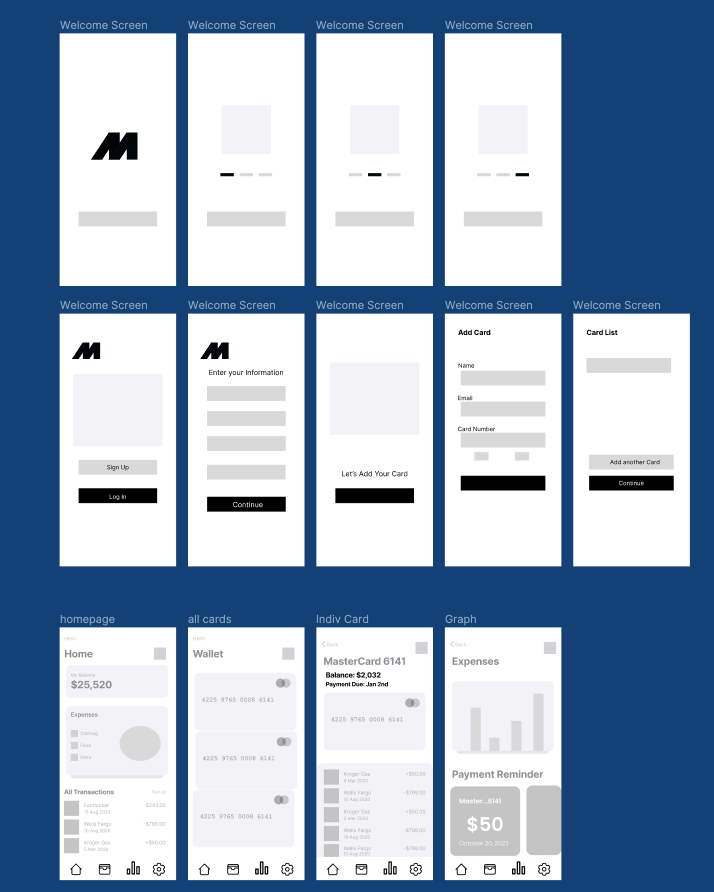
I transitioned to Figma to develop the low-fidelity designs. Although sketching screens is more efficient, I personally prefer using Figma to create cleaner-looking designs. This approach helps me visualize the layout of elements more effectively and produce better designs overall.
** Low fidelity wireframes of the onboarding process.
More Testing?
I wanted to make sure my designs resonated with users, so I sought their feedback at the low-fidelity stage. This helped me finalize the branding and solutions without scrambling to make complicated changes in the high-fidelity stage.
I conducted an in-person interview with individuals to gather feedback and here were my goals:
Identify areas for improvement and feature enhancements
Gather feedback on usability, navigation, and overall design
Results:
Users appreciated the consolidated balance view
Users requested seeing the card names (e.g., “Citibank Double Cash”) rather than generic labels
Users recommended including the minimum balance requirement
Branding
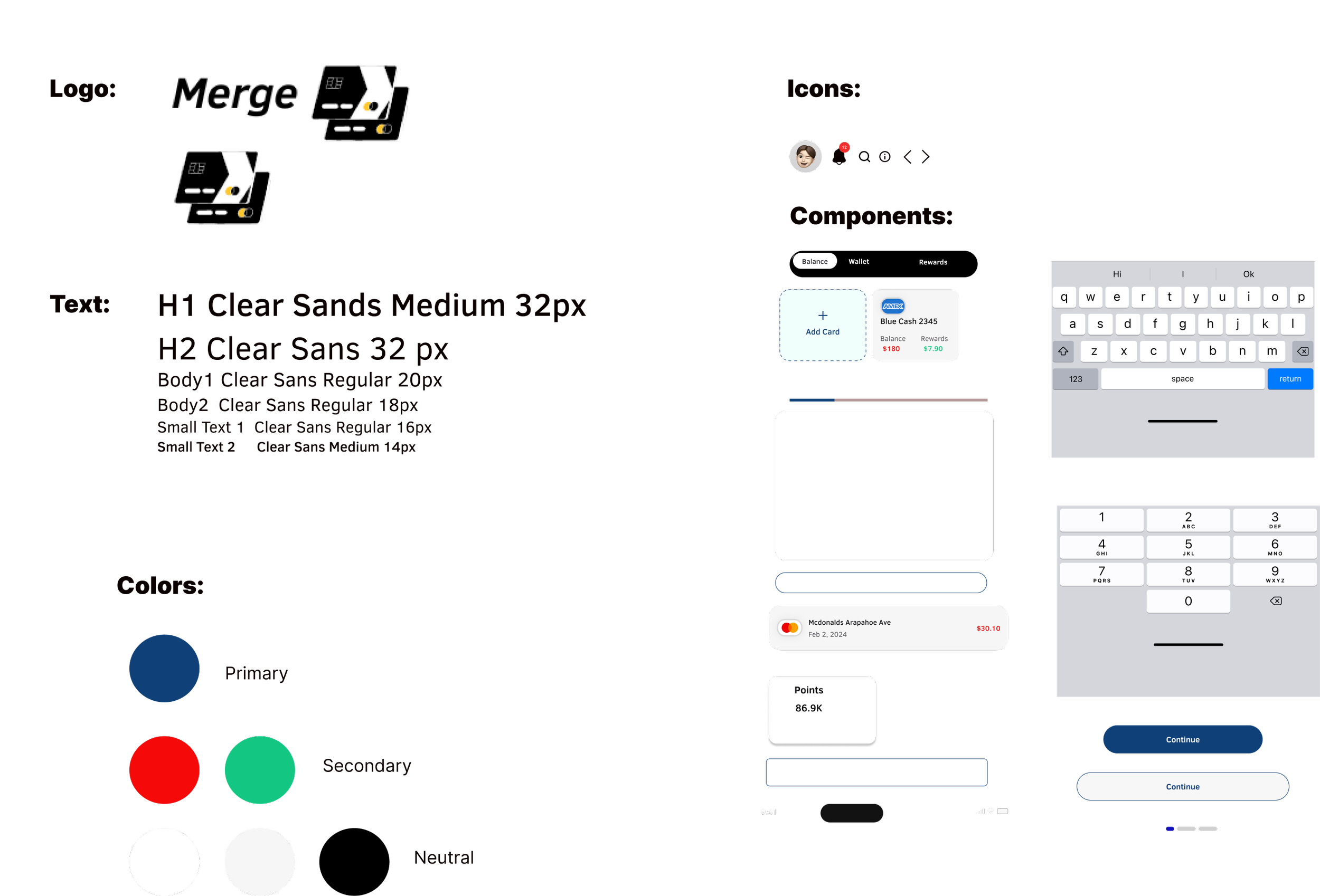
I was set on using the color blue for the app. I wanted it to feel trustworthy and soothing, especially since dealing with finances can be stressful. But keeping everything simple was tough. I focused on using clean fonts and logos to build trust with users and make the app feel familiar, like other financial apps they're used to.
** First iteration
I wasn't entirely satisfied with that direction. It didn't have the modern feel I was aiming for, and the colors seemed a bit too vibrant for what I had in mind. At last, I found the UI kit that just clicked for me. I took the time to tweak the components, play with the colors, and pick out icons until I landed on a design that feels calmingly simple and just right.
That was not the only makeover…
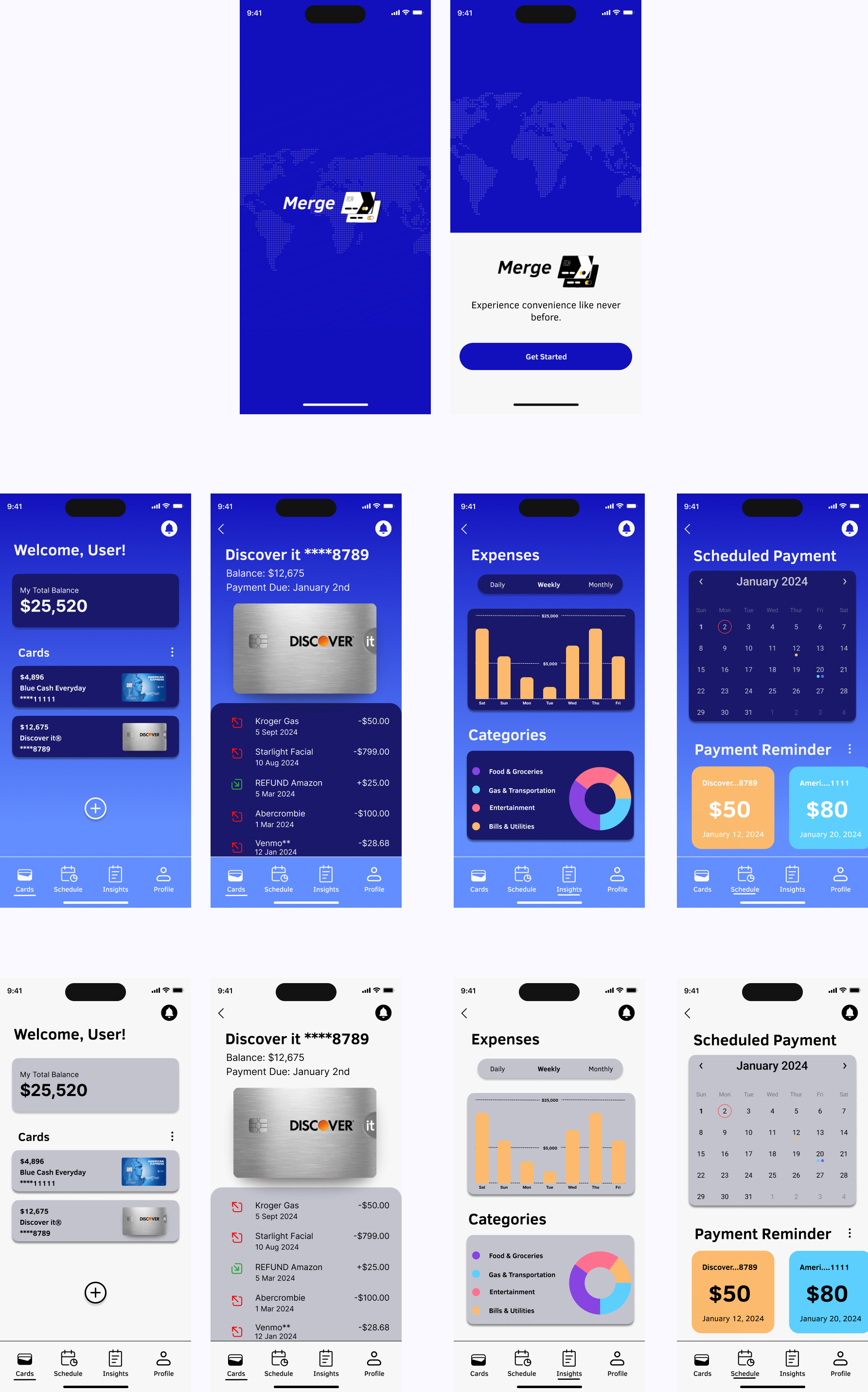
After following the basic structure of my Low-fidelity wireframes, I proceeded to create my High-fidelity wireframes. This stage involved incorporating branding elements, UI iconography, and refining the user flow to achieve a more polished look and feel.
**Onboarding High-fidelity


However, something felt off. I experimented with different colors to pinpoint what was unappealing and went back to the drawing board. As I looked back, I realized there was a clear difference between the clean and straightforward design of the onboarding process and the cluttered look of the dashboard.
** High-Fidelity Dashboard Version 1
New Dashboard Look
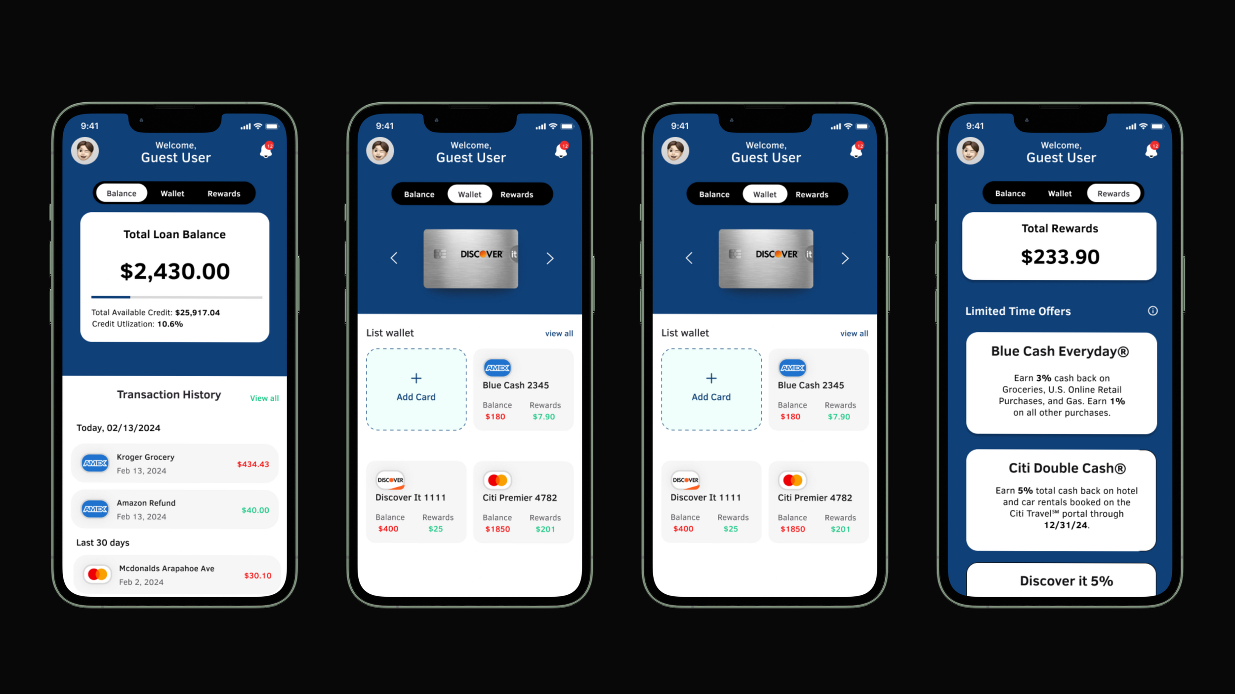
I decided to stick with the same vibe and style of the onboarding process while giving the dashboard a fresh look. I also removed unnecessary pages and made everything into one screen.
** Hi-Fidelity Dashboard Version 2
Usability Testing
Iterate, gather feedback, and repeat.
I asked the participants to follow three task flows using an interactive prototype, focusing on their interaction with the app and comparing it to other credit card consolidation apps. Additionally, I sought their opinions on the visual design and how it influenced their feelings.
Results:
The overall feel of the app is simple, clean, and easy to use
Some participants liked the onboarding questions, while others preferred to skip and fill out later.
Users enjoyed not having a homepage or many screen—as it replicated a widget based app.
After conducting the usability tests, I analyzed the findings to prioritize revisions to finalize my prototype for Merge.
Reflection
This project was truly challenging, pushing me to iterate repeatedly until I reached a satisfactory result. Knowing when to stop was a crucial lesson learned throughout the process. Designing entails knowing when to let go and accept imperfections. Despite the challenges, I take pride in conceptualizing an idea that could potentially assist individuals in consolidating credit cards.
Thank you so much for reading!


