ROLE
End-to-end UX/UI Designer,User Research
TOOLS
Figma, Figjam,
DURATION
6 weeks
Overview
TikTok is among the leading social media platforms, allowing users to create, share, and discover short video clips. It's not just about creative content anymore; it's also become the go-to spot for businesses and creators to share their ideas and products. With its easy-to-use features and personalized content, TikTok keeps users entertained, informed, and in the loop about what's happening.
Problem
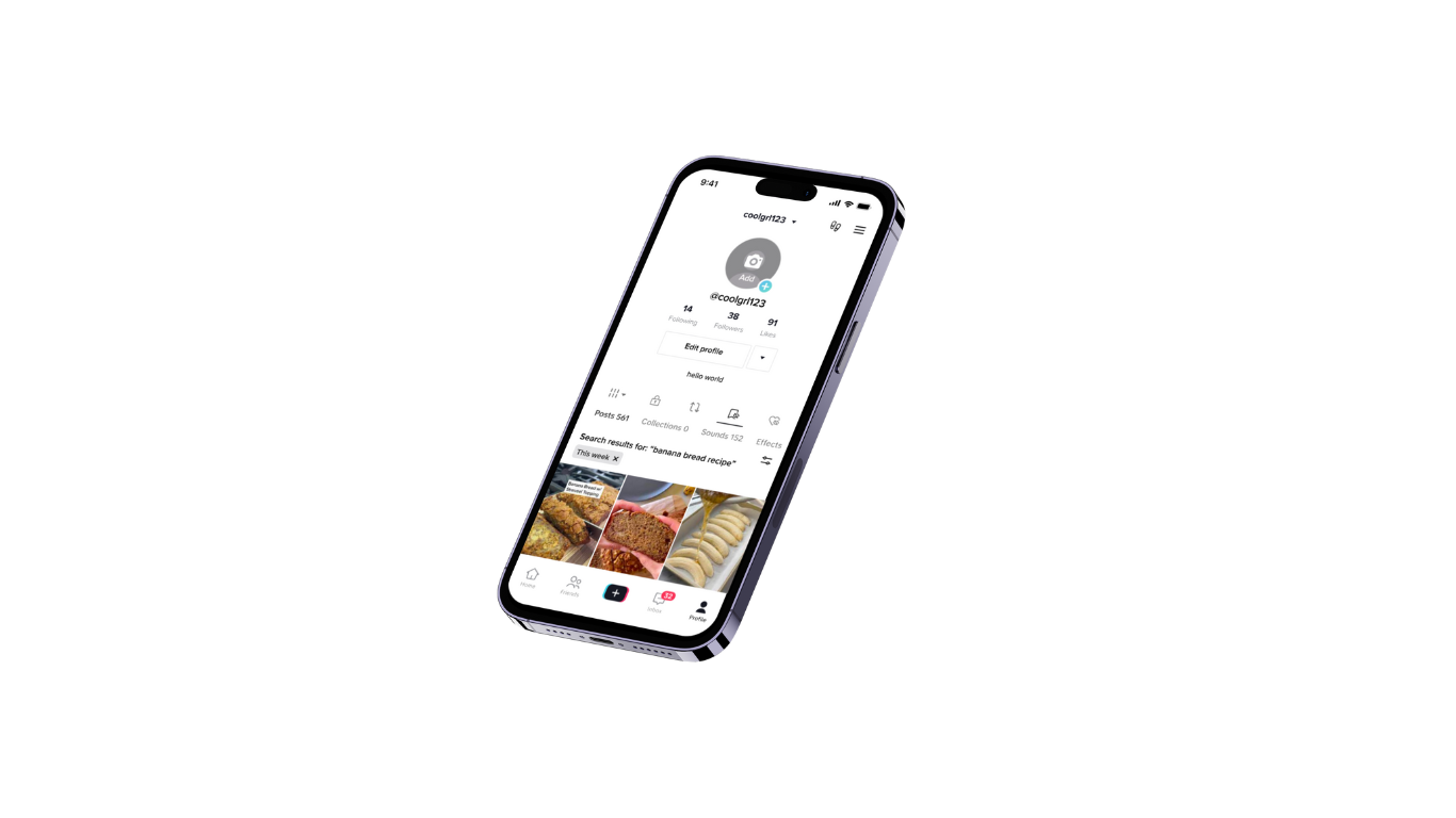
Although this app offers personalized content and a ‘folders’ feature, it currently doesn't allow users to search and filter through their ‘Favorite’ videos. Without this functionality, users find themselves endlessly scrolling to find specific videos, leading to frustration with the feature. TikTok already incorporates a liking system. Therefore, the purpose of the favorites section should allow users to easily reference videos for quick access.
Objective
Implement a feature within TikTok’s mobile app to allow users to easily find their favorite videos using keywords and filters.
RESEARCH
Connecting With Potential Users
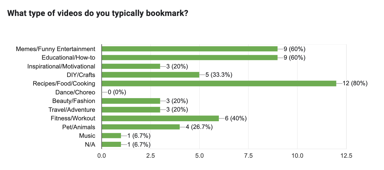
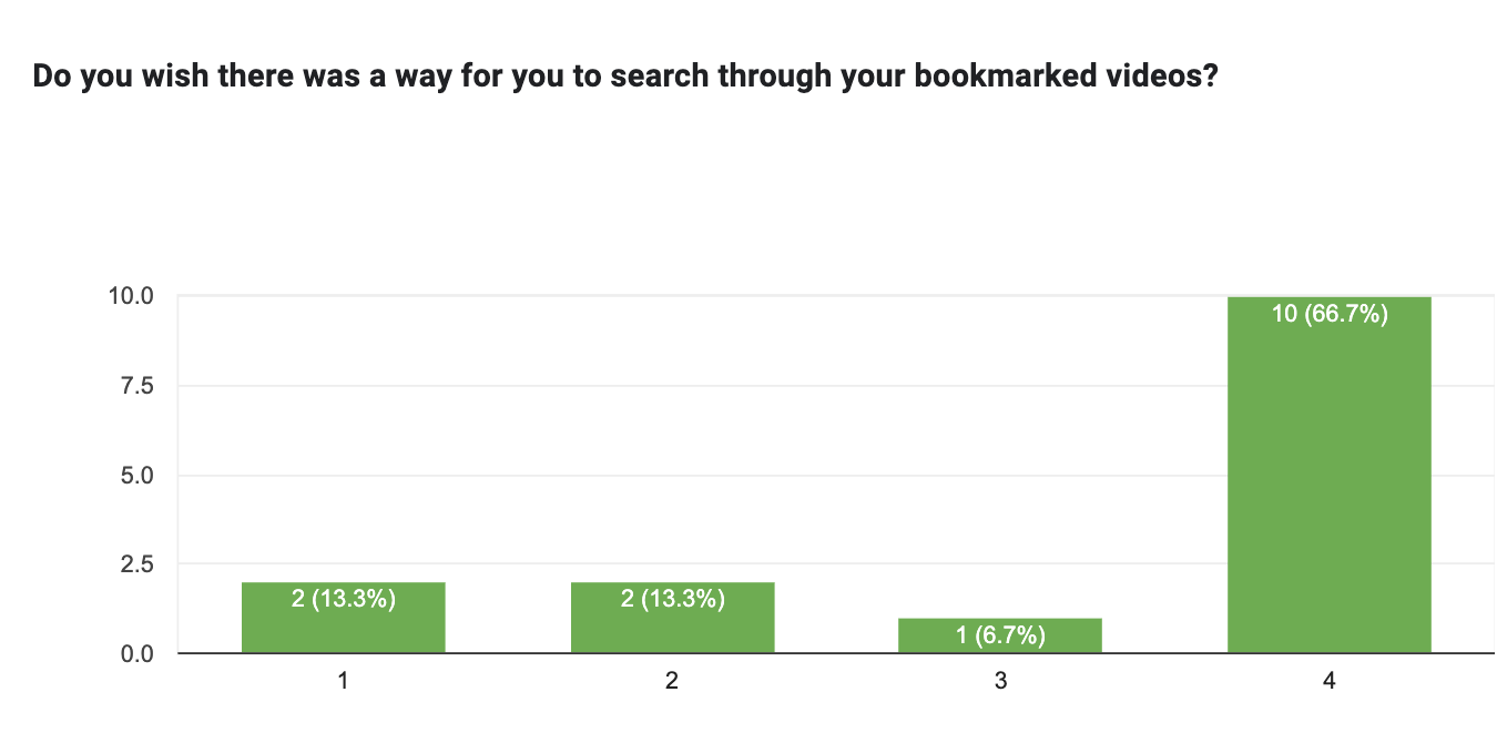
I conducted a user survey among current TikTok users to explore how they search and filter their favorite media with other similar apps.
Objectives
Understand the user experience with TikTok’s current state
Explore the user experience with similar platforms that feature search and filter capabilities.
Determine if users are interested in the ability to search and filter their favorites.
User Survey
Participants: 15 | Format: Google Forms
The survey was circulated on social media platforms such as Instagram, also known as TikTok's arch-nemesis. I found it most effective to recruit participants who are already active on other social media platforms to learn more about their usage patterns.
At the end of my interviews, I realized that not only am I not alone in needing this feature, but also:
Users did find it challenging to manage their growing list of favorite videos.
The favorite feature is inefficient and useless without having the ability to search/filter their videos.
Users rely heavily on visual memory to recall favorites, which can be time-consuming and ineffective.
Turning Problems into Solutions!
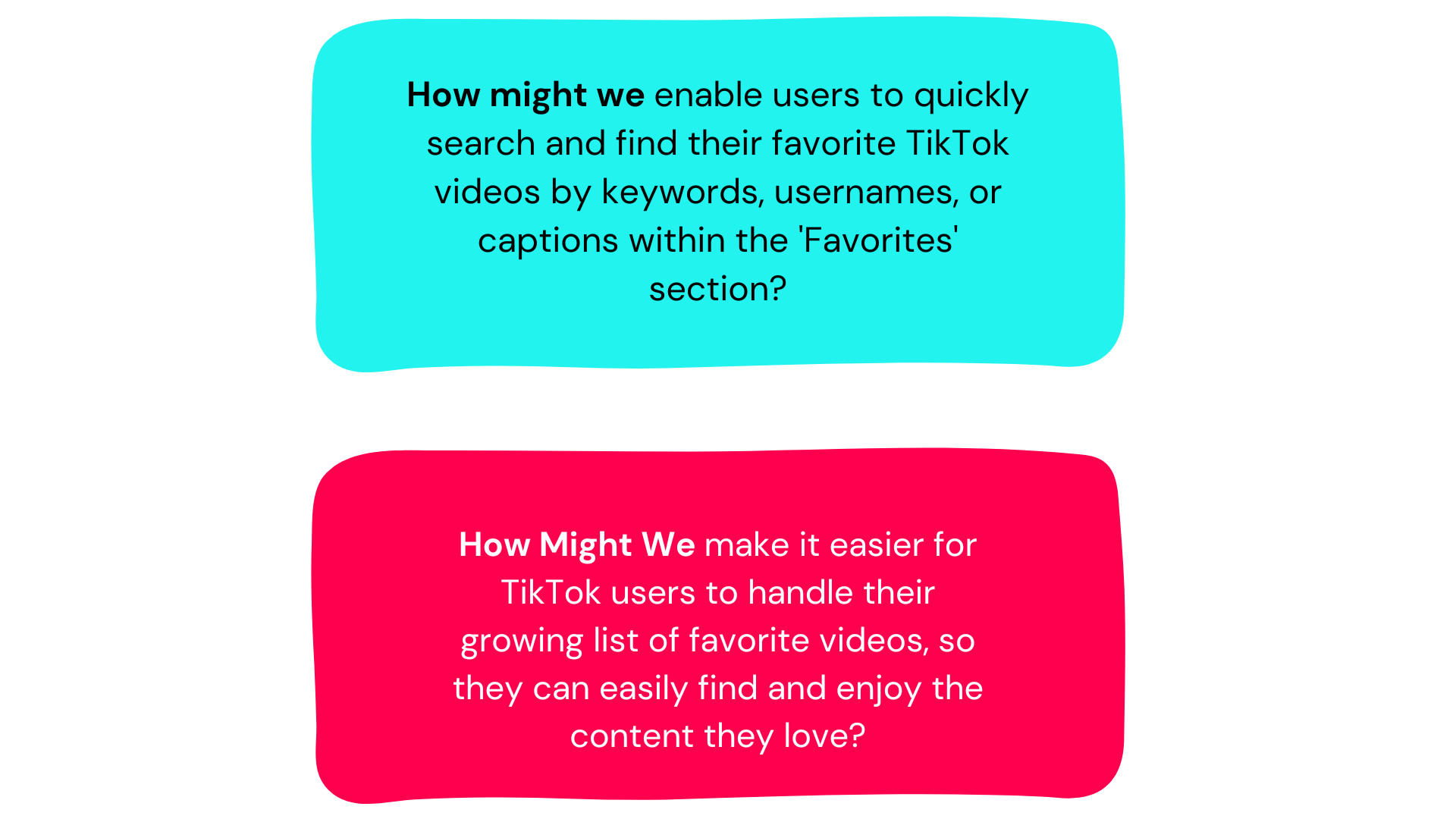
Developing "How Might We" questions was a crucial step to transform all this data into ideas for this feature. Each question was created to tackle the users' concerns, desires, and requirements.
User Persona
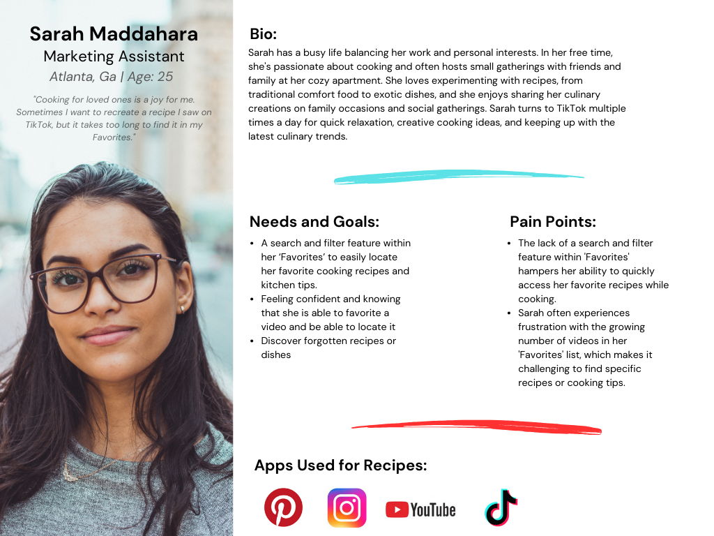
Based on the research gathered, I defined a persona that represented the target user. I focused on the goals and frustrations of the persona and how they would interact with the product, which affected my design decisions.
**User Persona Graphic
Sarah exemplifies the sentiment of the 15 users I surveyed. Consider her situation:
You're excited to try a cool recipe you saw a few days ago. But when you check your favorites, you realize you've saved 10 other recipes too. You hope the thumbnail will help you find it, but you end up scrolling forever just to find it.
Now, TikTok assumes that you have used their existing 'collections' feature, but even if you placed it in one of your TikTok collections, it's still like playing hide-and-seek with the video.
IDEATE
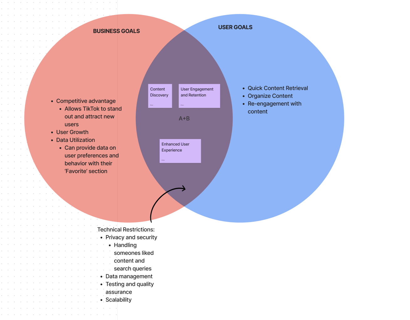
Time to use my findings from user research to define the business, user, and common goals for this feature. In this step, I challenged myself to allocate my goals into a Venn diagram within just one minute.
** 60 second Venn Diagram that outline Business and User goals
Feature Set
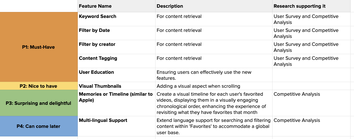
With goals set, it's time to prioritize the themes or components within my desired feature. I've compiled a list of components based on my research conclusions.
The features are categorized into what is necessary and what could be added in the future. This served as my checklist for ranking what I needed to focus on and what could be added in the future.
User Flow
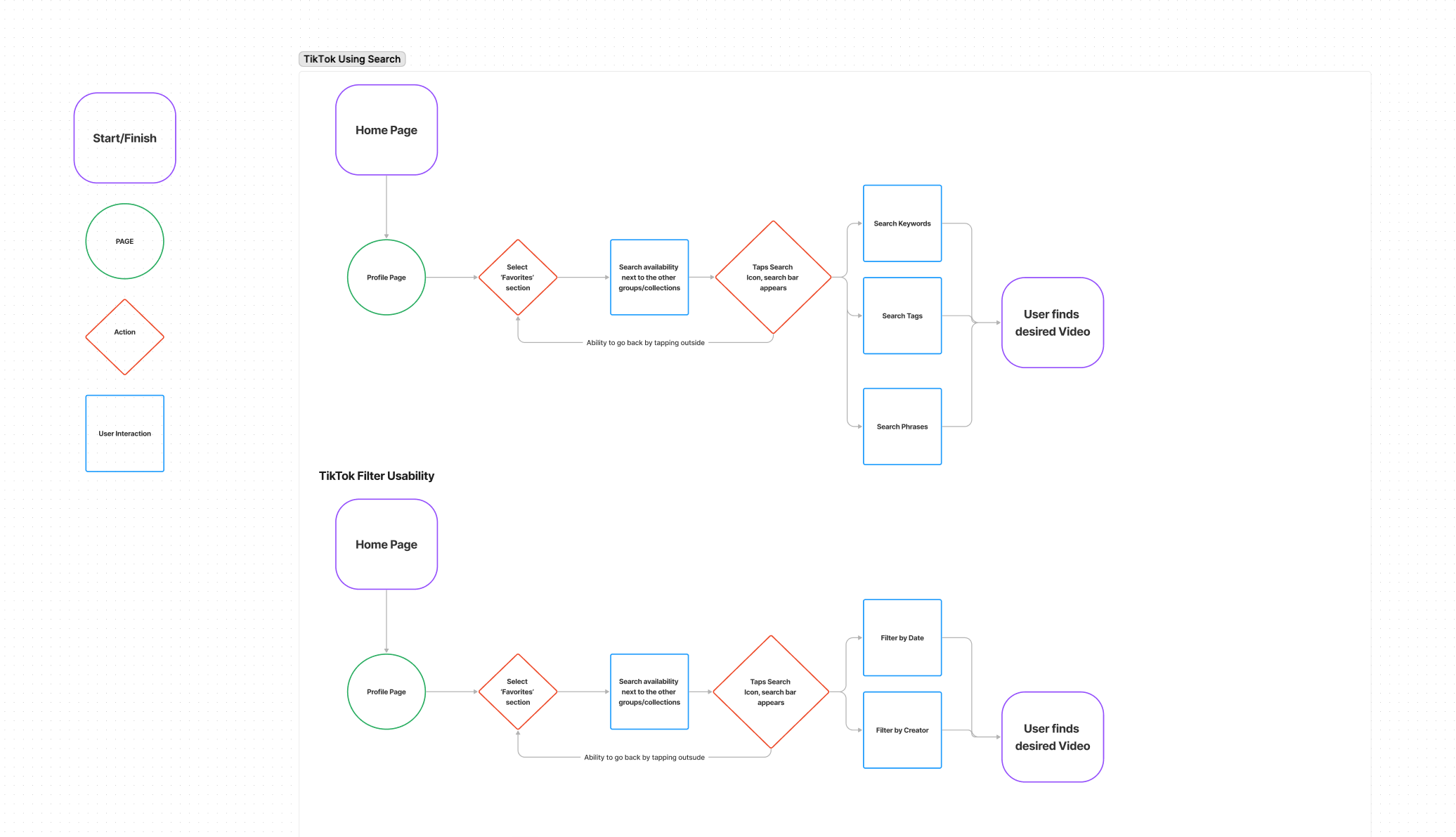
I mapped out two user flows that represented necessary and important features
** Two User Flows: Search and Filtering flows
DESIGN
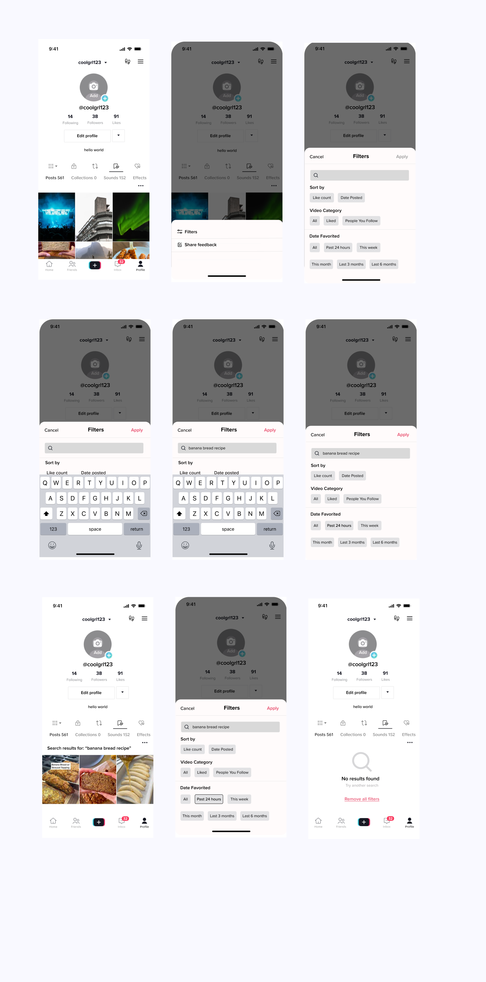
Now I knew what features my app needed. I just had to visualize my ideas to make them real.
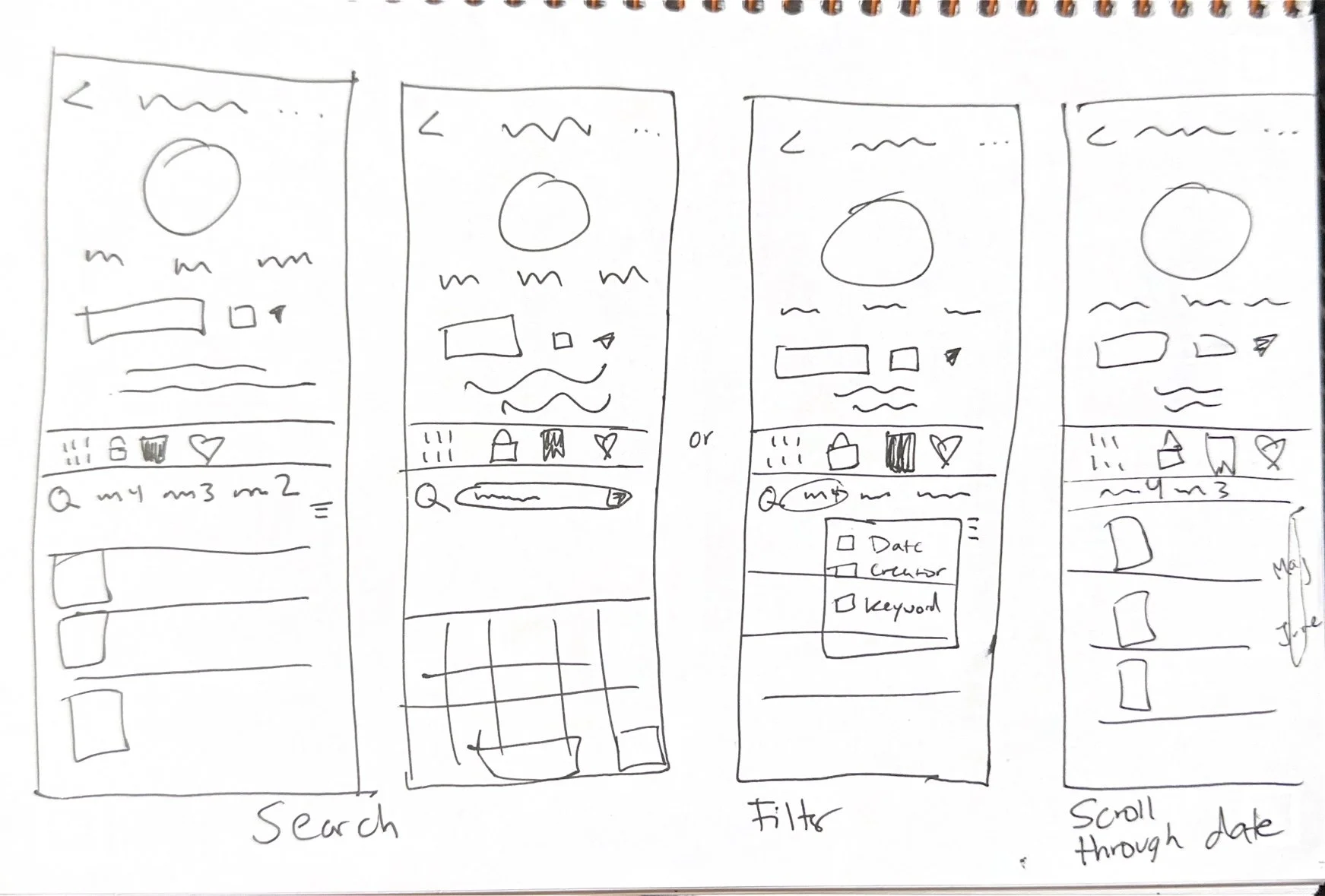
I began creating my designs with a Low-Fidelity Wireframe. I started by sketching my feature ideas until I could narrow down a specific feel or look that I liked.
**Low-Fidelity Wireframe
Hi-Fidelity Wireframes
**High-Fidelity Wireframes
The pros of creating a feature set for an established product include having the branding and UI already figured out. However, the con is that I sometimes felt limited because I couldn't deviate too much from TikTok's normal branding.
There were moments when I considered completely redesigning the app, but that would defeat the purpose. My goal was to create a feature that was seamless and intuitive for users. The user shouldn't need training; the feature should be easy to understand. Therefore, I ensured continuity with other features and flows in the app to make the experience effortless for the average TikTok user.
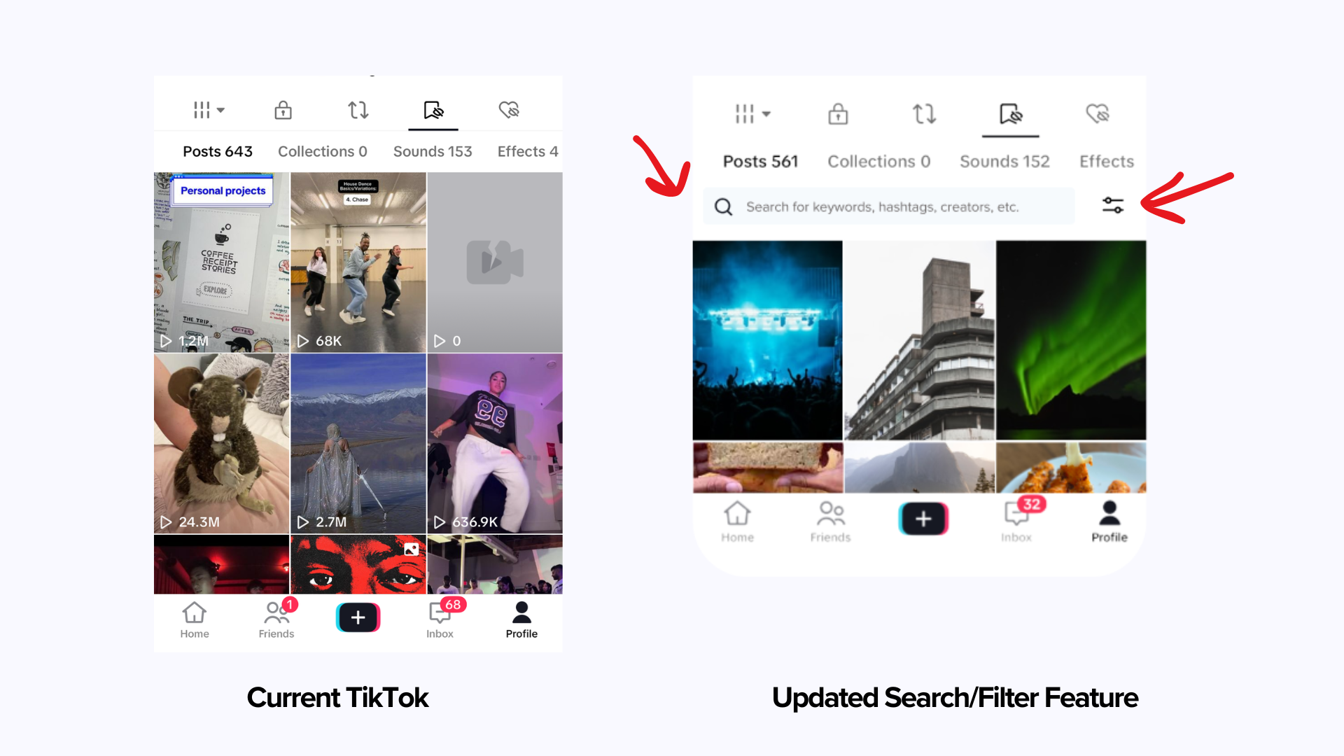
Before & After?
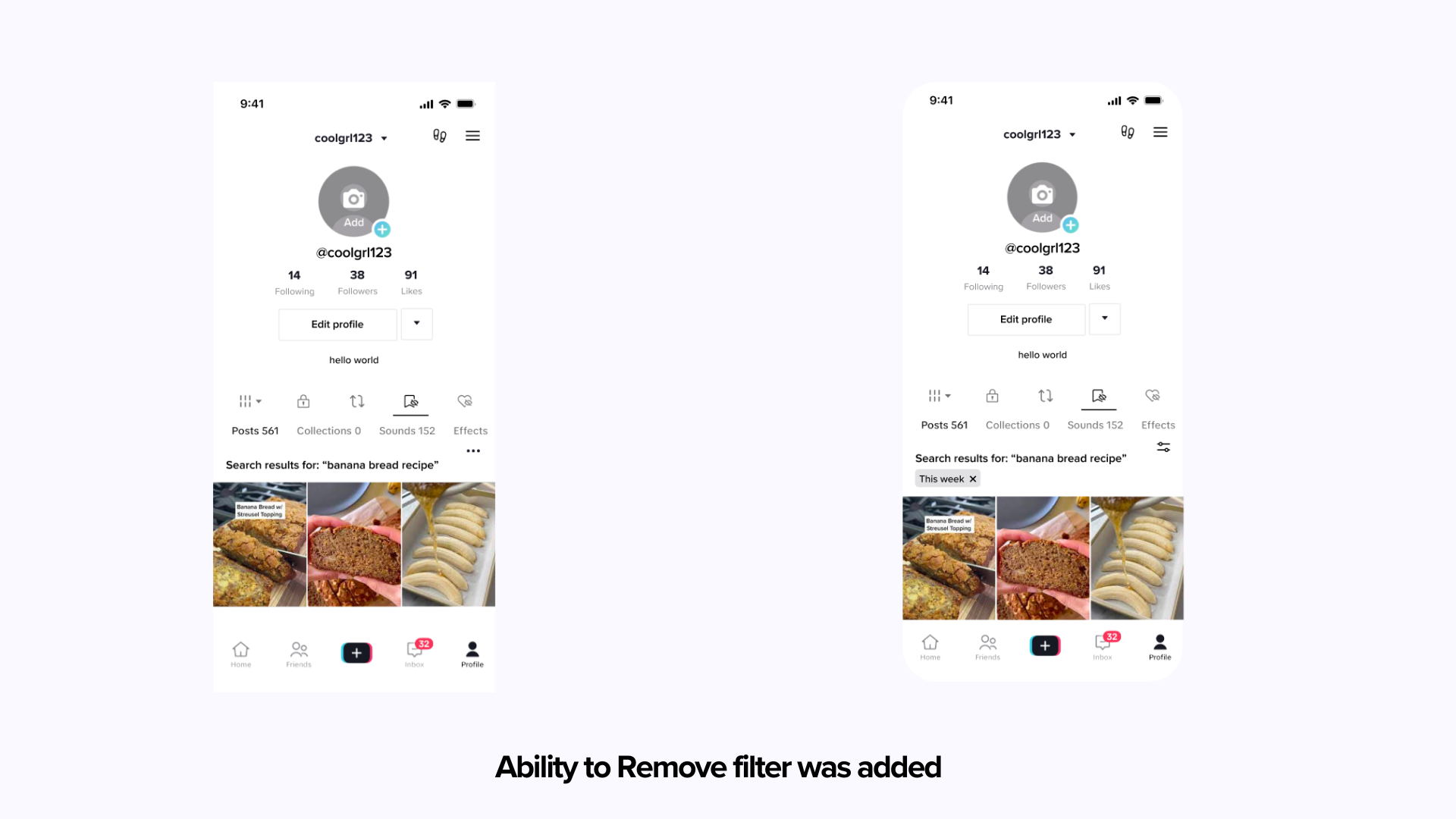
You may or may not have the screen time (which I am incredibly envious of) to notice the difference. So here is a before-and-after comparison.
Usability Testing
To put my design choices to the test and identify user pain points, I created a prototype for my two user flows and recruited participants to utilize the app.
The participants received minimal instructions to ensure the design was intuitive and aligned with TikTok's established standards. Their primary objective was to search for a recipe and filter the results.
Results
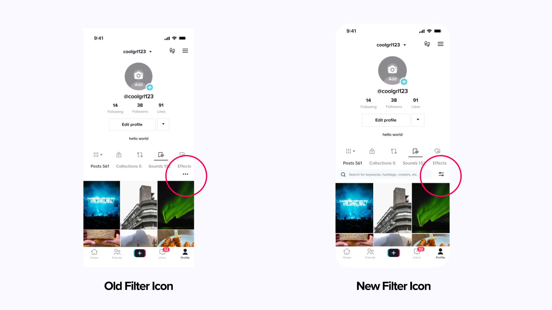
The filter option from TikTok’s UI component set proved to be confusing or cumbersome.
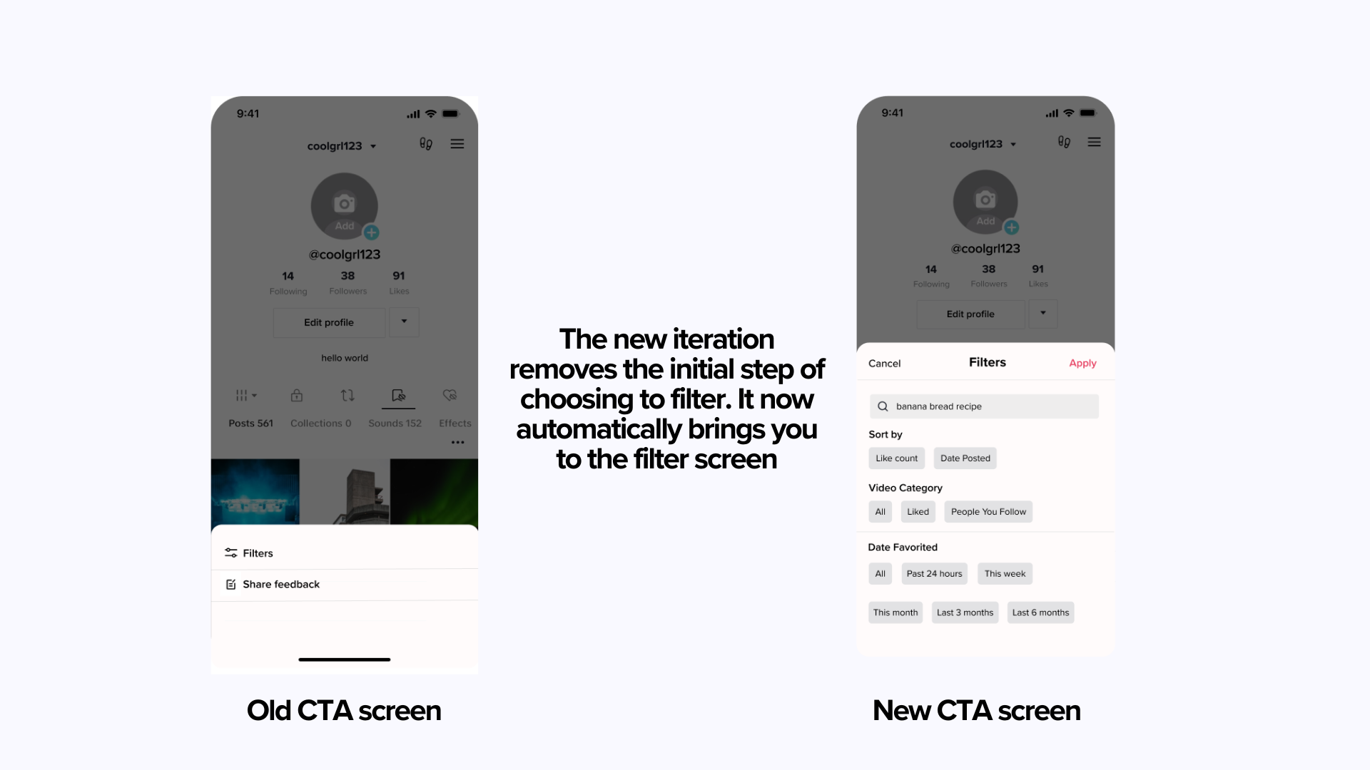
Participants expressed a desire for a more prominent and effective call to action for searching or filtering content.
Taking these findings, I was able to iderate and finalize my final prototype.
I moved away from TikTok’s UI set and utilized a familiar filtering icon
FINAL PROTOTYPE


TAKEAWAYS
What I’ve Learned
Iteration and feedback are vital aspects of the design process. Despite our ego often convincing us that our design is the ultimate solution, it's essential to seek feedback to validate and improve our design decisions.
Working on this project to add a feature was truly fulfilling because it involved something that mattered to me personally—something I could see myself using. This idea had been brewing in my mind long before I ventured into UX design. Being able to make it tangible felt like scratching an itch in my brain.
Thank you so much for reading!


